

Cut the letter O out of a sheet and you have two problems: a hole shaped like an O, and a little oval island lying on your desk that used to be the middle. Spray through the hole without that island and you get a solid blob. Every stencil that ever fell apart in someone's hands failed at this exact spot, and the fix is a sliver of material called a bridge.
What a bridge is

A bridge is a strip of stencil material left uncut across an opening, tying a floating piece back to the rest of the sheet. It prints as a gap in the paint, which is why stencil lettering has that unmistakable broken look. The military crate font is not a style choice. It is engineering you can read.
Size them to your material. On paper and card stock, leave bridges at least a quarter inch wide or they tear on the first pull. Mylar and plastic hold together down to an eighth of an inch. Thinner than that and the bridge survives the cutting but not the peeling.
Where you need them

Scan your design for anything that would fall out if you finished cutting. Type is the classic case. The letters A, B, D, O, P, Q and R all have enclosed counters, and every one needs at least one bridge. Numbers 0, 4, 6, 8 and 9, same deal.
Then look for islands in the artwork itself: the pupil inside an eye, the highlight inside a pupil, a window inside a building silhouette. If a shape is surrounded on all sides by cut, it is an island, and it needs a bridge or it needs to disappear.
Where to put them

Two bridges sitting opposite each other hold an island better than one wide one, and four beats two on anything bigger than a coin. Space them evenly so the island cannot pivot.
Put them where the eye already expects a break: at the corner of a jaw, along a fold in clothing, where a stroke changes direction. A bridge that crosses the middle of a long smooth curve is the first thing anyone sees. The same bridge moved to a corner disappears into the drawing. And keep them short. A bridge only has to cross the gap, not tour it.
If a bridge snaps mid-session, do not toss the stencil. Lay the island back in position and tape across the break on both faces with clear packing tape, then trim the tape flush with a blade. A field repair like that will survive the rest of the run.
The halftone loophole
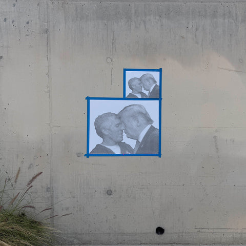
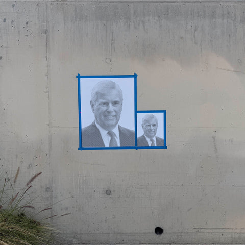
One kind of stencil skips this whole problem: halftone. A halftone portrait is thousands of separate dots, and every dot is its own self-supporting hole in the sheet. No islands, no counters, no bridges, no broken look. That is the trick that lets a photorealistic face come off a single sheet, and it is why our custom stencil builder converts photos to dots before cutting. The dots are not a style. They are ten thousand bridges you never had to draw.


0 comments