

Painting one image with a stencil is easy. Painting a word is where most people quit. You tape up the first letter, spray it, move the stencil, eyeball the gap, spray again. By the fifth letter the baseline has drifted and the gaps are three different widths. Up close it looks fine. From across the street it reads like a ransom note.
The fix is not a steadier hand. The fix is letter stencils that connect to each other, so spacing stops being your job.
Why loose letter stencils fail
Most alphabet stencils come as a pile of loose letters in different widths. Every letter you add forces three decisions: how far from the last one, how high, how level. You make each call by eye, and the errors stack. A slow two degree drift is invisible while you work and obvious the moment you step back.
Sign shops solved this decades ago with tracks and spacing guides. Spray lettering never got the same treatment. That is the gap a font pack closes.

How the latch system works
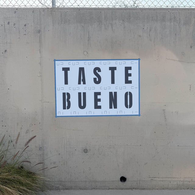
A font pack is 26 cards, one letter per card, and every card is the exact same width. The edges of each card carry a latch pattern, so any card locks into any other card, side to side or stacked into a second line. You latch the cards into your word on the ground, carry the whole group to the wall, tape the outside edge, and spray.
Spacing, baseline, and line height are decided by the cards, not by you. Because every card is the same width, the gap between letters is identical across the whole word, which is most of what makes lettering look professional.
Letters with enclosed centers, like A, B, D, O, P, Q and R, carry bridges: small tabs that hold the middle of the letter in place. We cut them as clean vertical channels that sit flush with the letter stems, so they read as intentional stencil style instead of damage. That look is the whole reason stencil fonts exist.
Two fonts, two moods
The packs come in two typefaces. Anton is the heavy one: thick, blocky, loud. It is the closest thing to classic protest lettering and it stays readable even with sloppy spraying. Bebas Neue is tall and condensed. It fits more letters into the same wall width and reads more like a poster headline than a picket sign.

If you are painting one strong word, use Anton. If you are painting a phrase, use Bebas Neue.
Sizes and materials
Each pack comes in five card sizes, from 2x3 inch cards with letters about an inch and a half tall, up to 12x17 inch cards with letters over nine inches tall. The small end handles crates, toolboxes, mailboxes and shop signs. The big end handles walls.
Card stock is the cheap way in and survives a handful of careful sprays. Plastic is mylar: it wipes clean between colors and keeps its edges through heavy reuse. If you are only painting the word once, card stock is fine. If the pack is going in your kit, get plastic. We covered the material differences in detail in our mylar thickness guide.
Packs start at $10.95 for the small card stock set.
Spraying a clean word
- Latch the full word together on the ground first. Check the spelling. Check it again. Painted typos are permanent typos.
- Tape the outside perimeter of the latched group to the wall. The latches hold the inside together, so you only need tape on the border.
- Press the bridges and letter edges flat with your palm before you spray. Gaps under the edges are where bleed comes from.
- Spray light. Two thin passes beat one wet one every time. Hold the can about eight inches off the surface, and keep it moving. We wrote up the full technique in how far to hold the can and how to spray a clean stencil.
- Peel while the paint is tacky, pulling each card straight back off the wall.
If you want the paint itself to behave, our spray paint roundup covers what works and what bleeds.

Words plus images
Lettering gets interesting when you pair it with an image. A portrait stencil with one word under it is the oldest one-two punch in street art, and it still works. If you cut your own, the Stencil Library has our full catalog of portrait designs as cut-ready files for five bucks a month.
0 comments